Pharmacy Digital Storefront
Feature: Marketing pages and brand assetsPlatforms: WebTimeframe: 2022-24Role: Primary product designer partnering with a content designer. For the photography, I served as art director and photo editor. For the brand assets, I was a collaborator along with our pharmacy marketing partner.
Manage Pharmacy profiles
Feature: Profile management
Platforms: native and web
Timeframe: 2023
Role: I served as the primary designer leading the project. I worked with our product owner and product manager to define technical requirements and worked through to QA with engineers.

Accessible from the main navigation of heb.com, these pages introduce customers to H-E-B Pharmacy's full range of services.
Users
Primary user
Prospective H-E-B customers
- Learn about H-E-B Pharmacy offerings
- Check if H-E-B has a certain offering
- Compare our service offerings to their current pharmacy provider
“Why should I switch to H-E-B?”
Secondary user
Current H-E-B Pharmacy Customers
- Get details about an offering they are aware of
- Learn about H-E-B Pharmacy offerings
- Learn about short-term (seasonal) offerings
“How do I get my flu shot this fall?”
Tertiary user
Employers
- Learn about the H‑E‑B RxTRA Advantage program
- Understand how to contact H-E-B or sign up for RxTRA Advantage
“What options do I have for my business?”
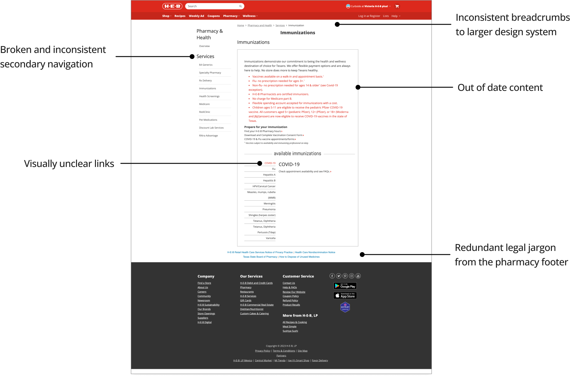
Original Live Pages
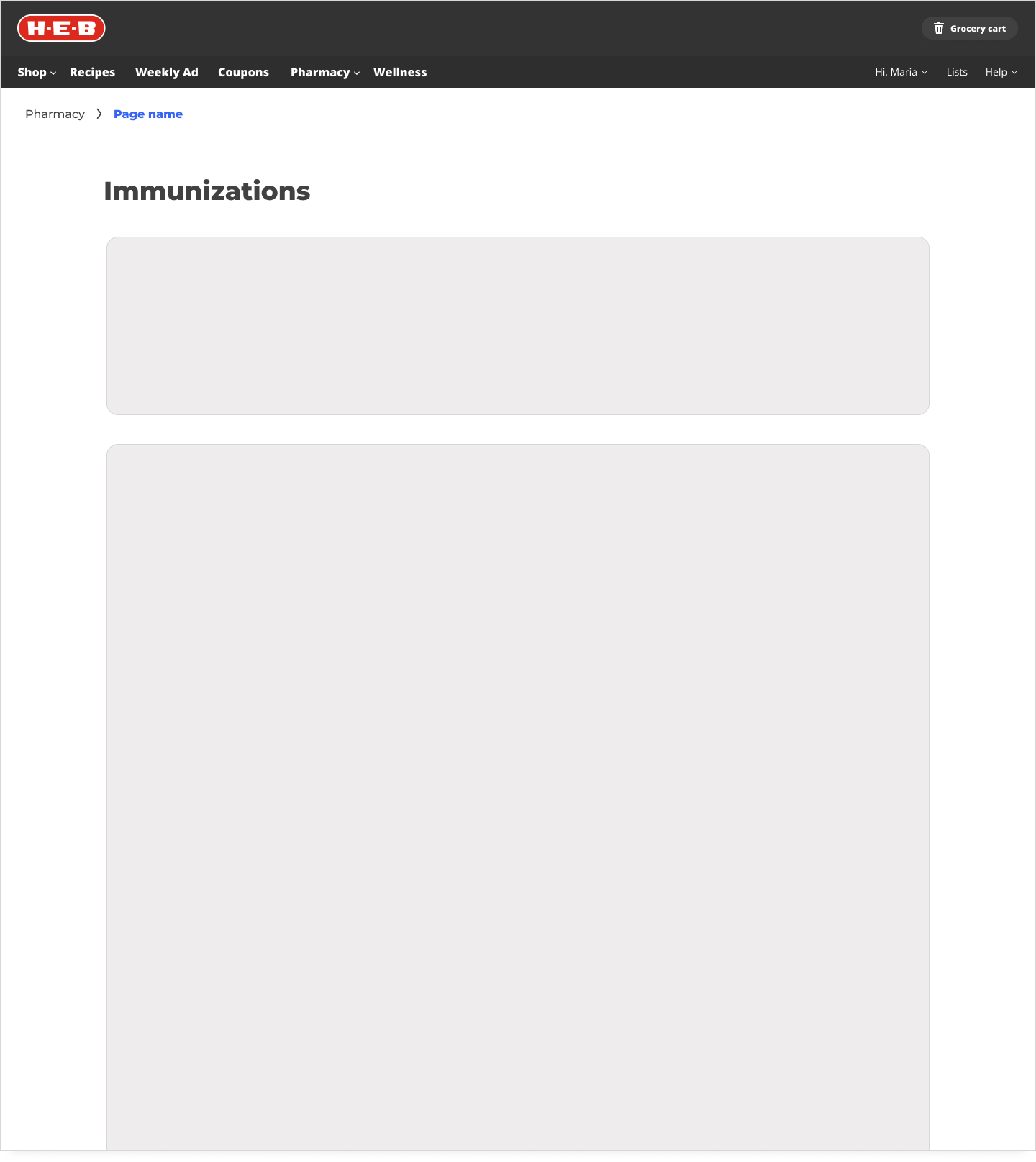
Not only unattractive, the pages were unmanaged and outdated when I joined the team. While all the marketing pages had severe heuristic issues, the immunizations page is a clear example of the worst themes in violations across the pages.
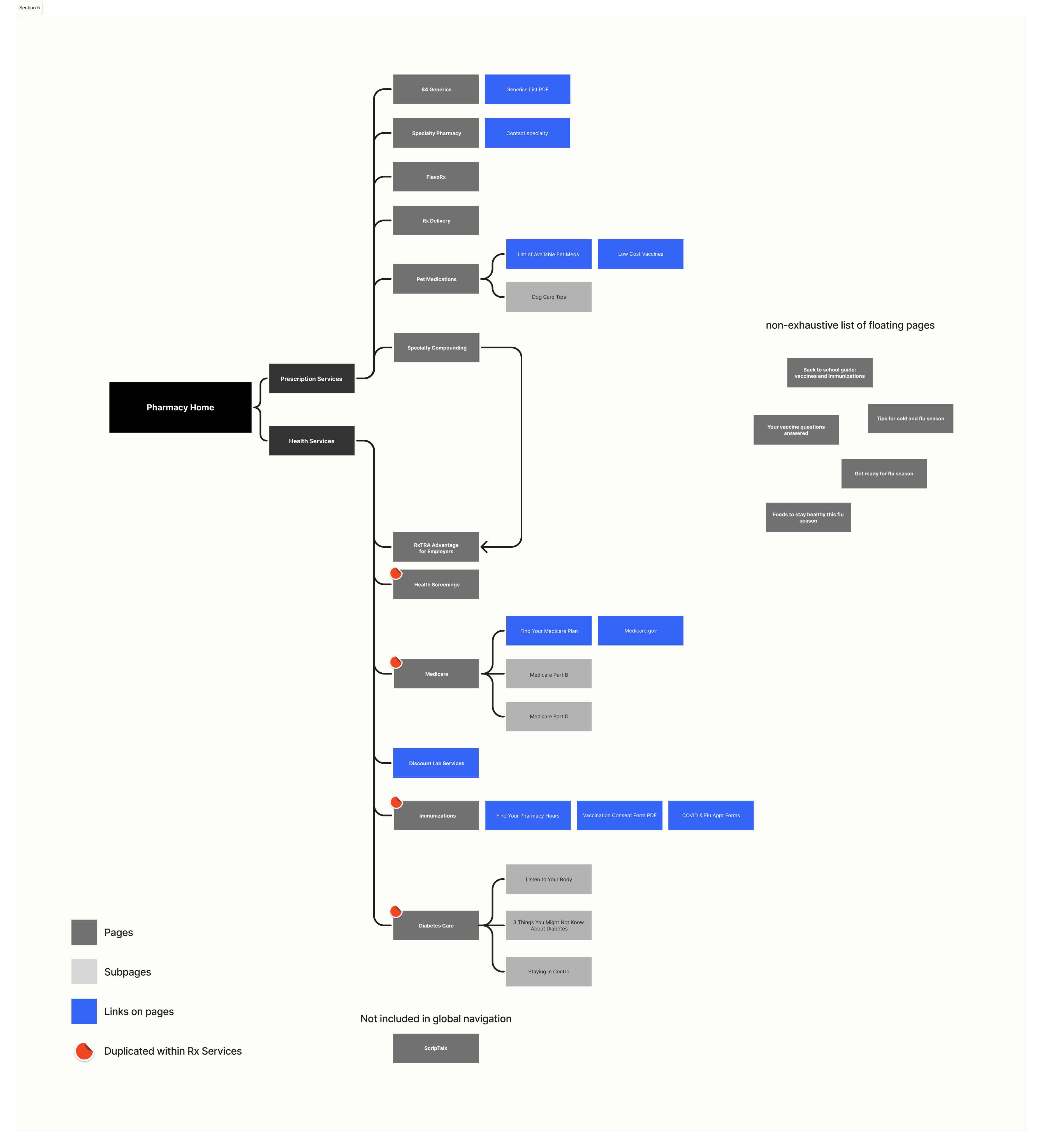
Original site map
The original site map highlights the inconsistencies across the pages. There were broken links, pages not discoverable from the global site navigation, pages only discoverable from google search, and redundant information repeated on multiple pages.
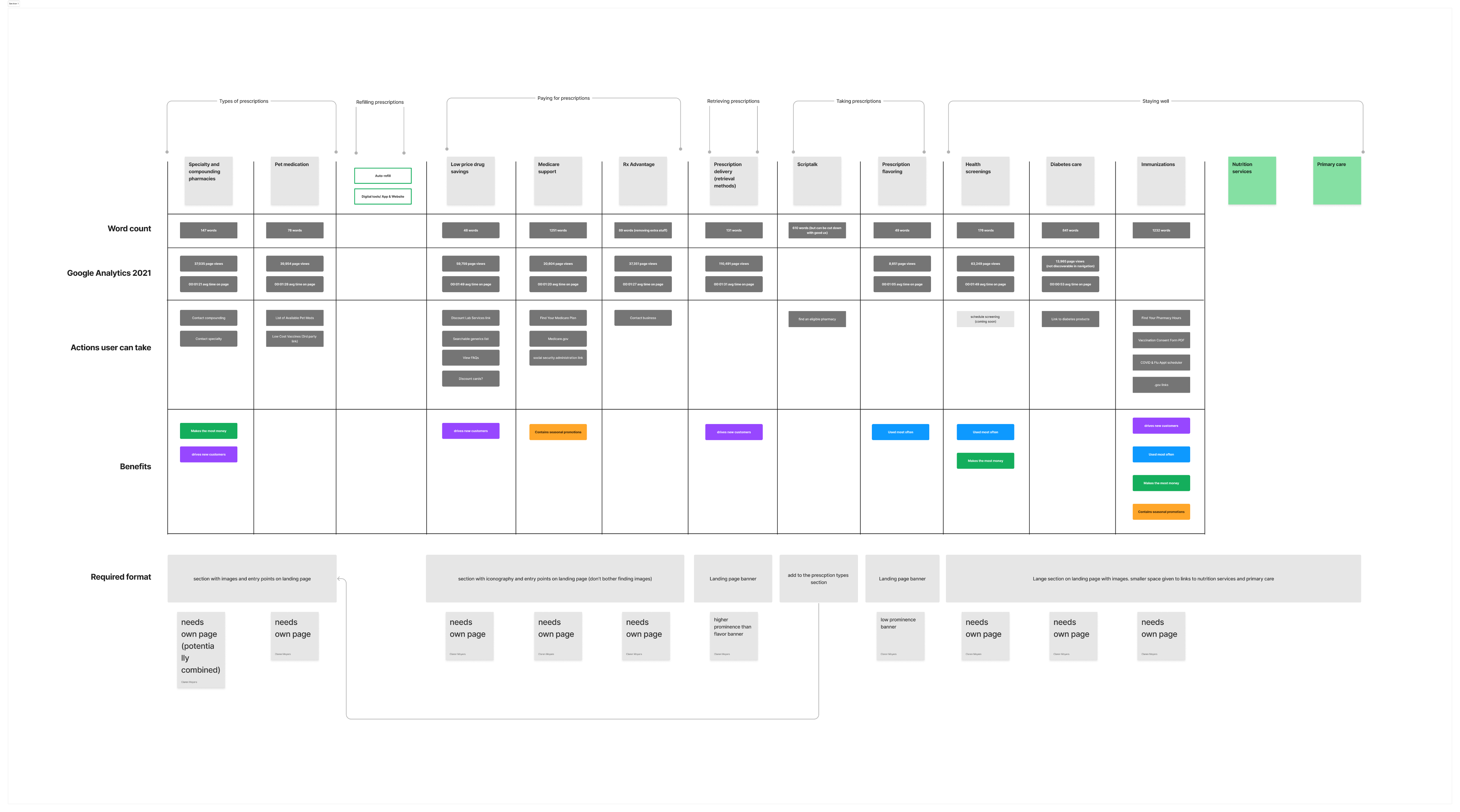
Decision Matrix
We decided on a new information architecture through card sorting exercises and meetings with business stakeholders. The decision matrix combines all the factors we considered.
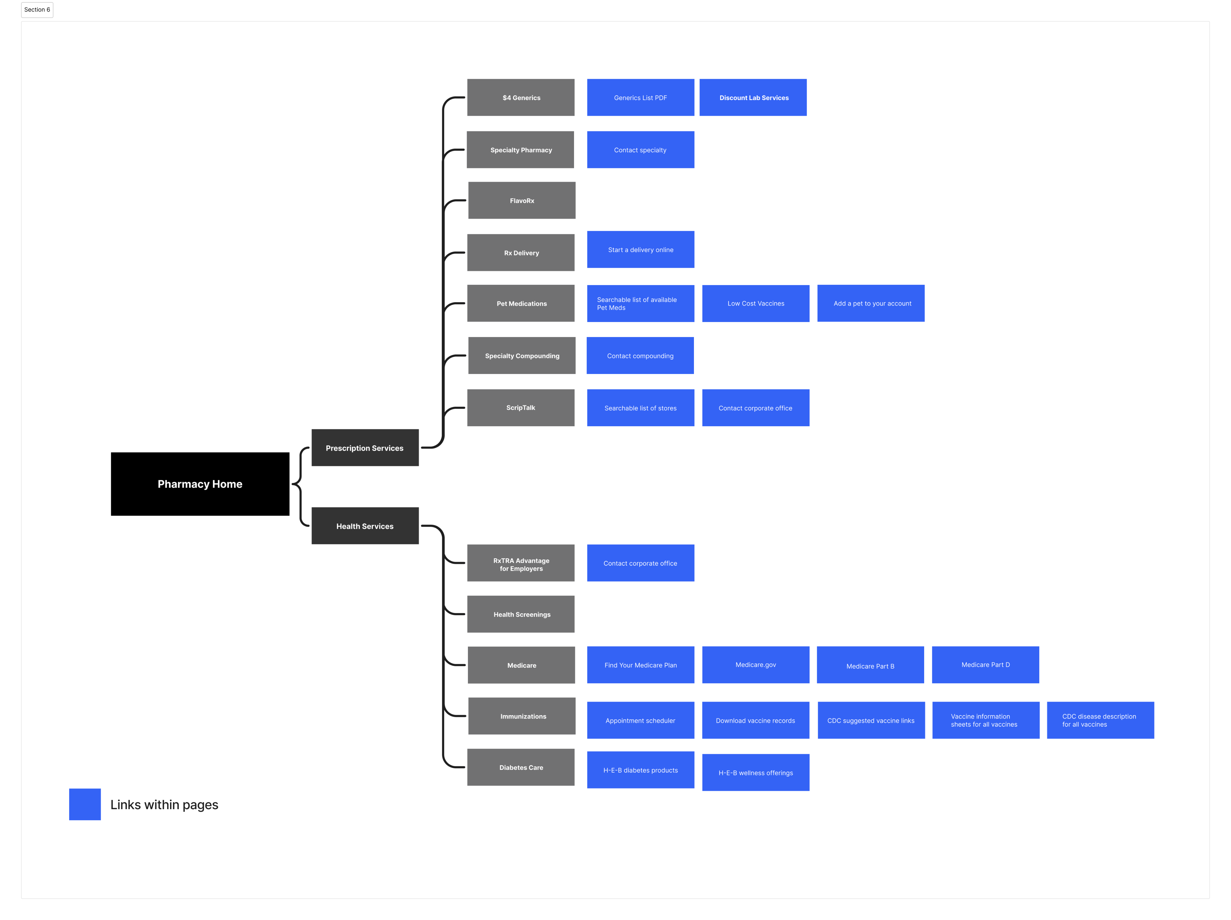
New Site Map
The updated site map shows our new focus on making the service pages actionable. The old pages were ineffective at converting customers into action. In this new format, we provide links to next steps or further resources on the topic.
Base Template Work
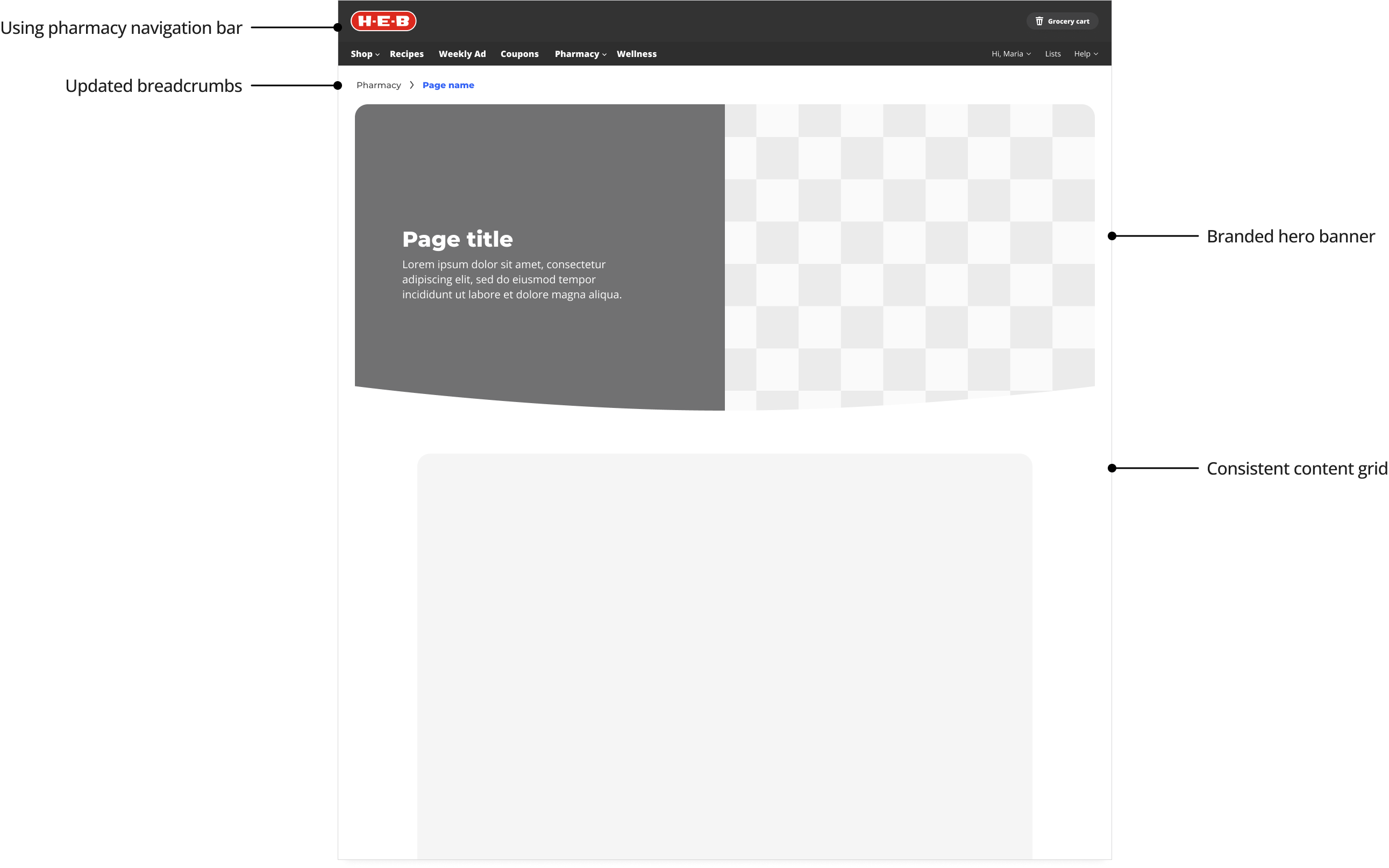
Moving into working on the UI, the first step was to define a base template that all the pages could use.
Concept Options
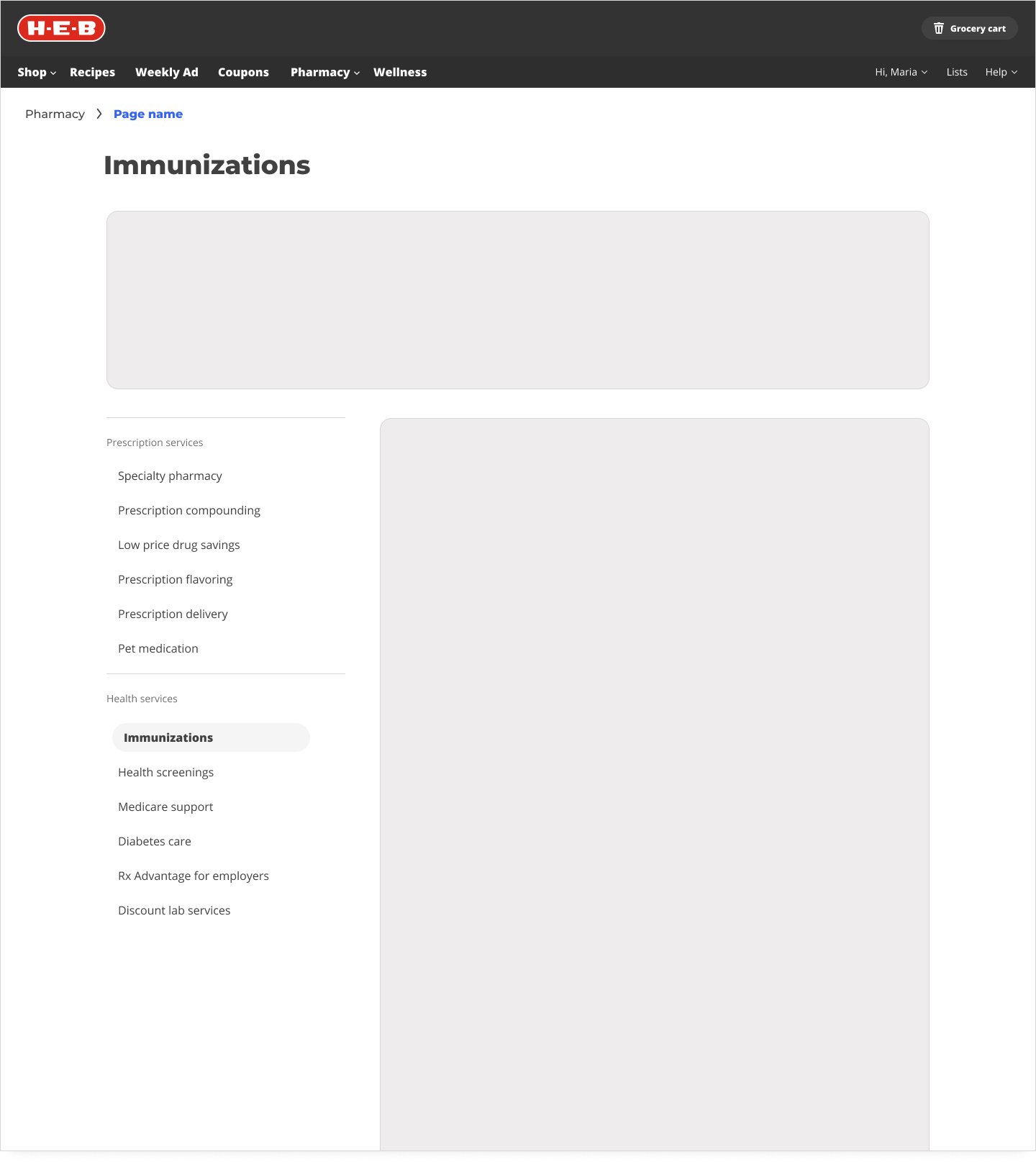
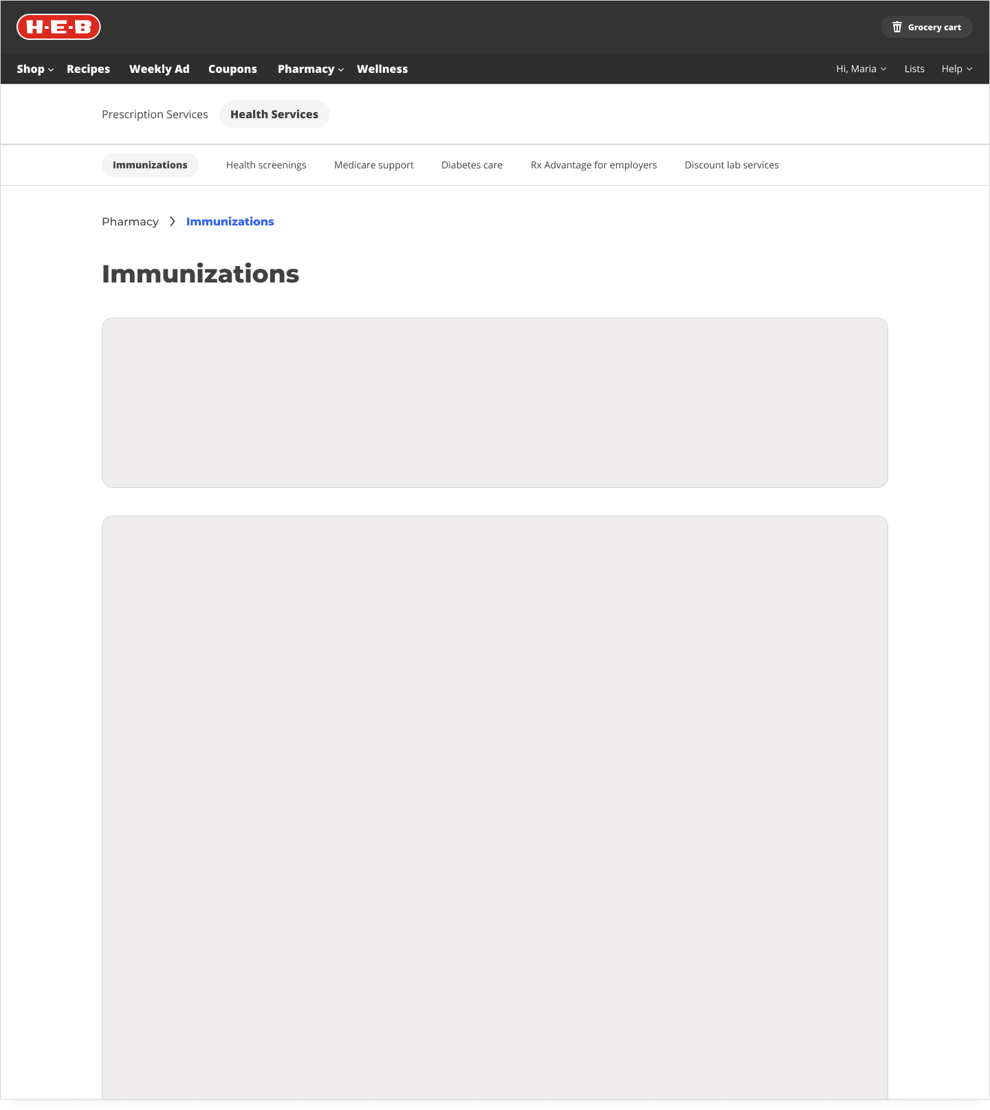
Final Template
Pivot!
Throughout this process our design team was advocating for the need for new visual assets to make to overhaul worthwhile. What’s the point of restructuring some content if it’s still going to look unappealing?
The first step was to define our vision for what pharmacy and wellness at H-E-B should represent. Visuals follow the vision.
Empowering Texans with accessible food, care, and guidance that improves health outcomes and puts people over profits
Inclusive
Visual design should never come at the expense of accessibility.
A clean and simple UI is the top priority, and visual identity is the icing on the cake.
Related
The digital experience sets the stage for customer’s experiences with partners in stores, clinics, and telehealth calls.
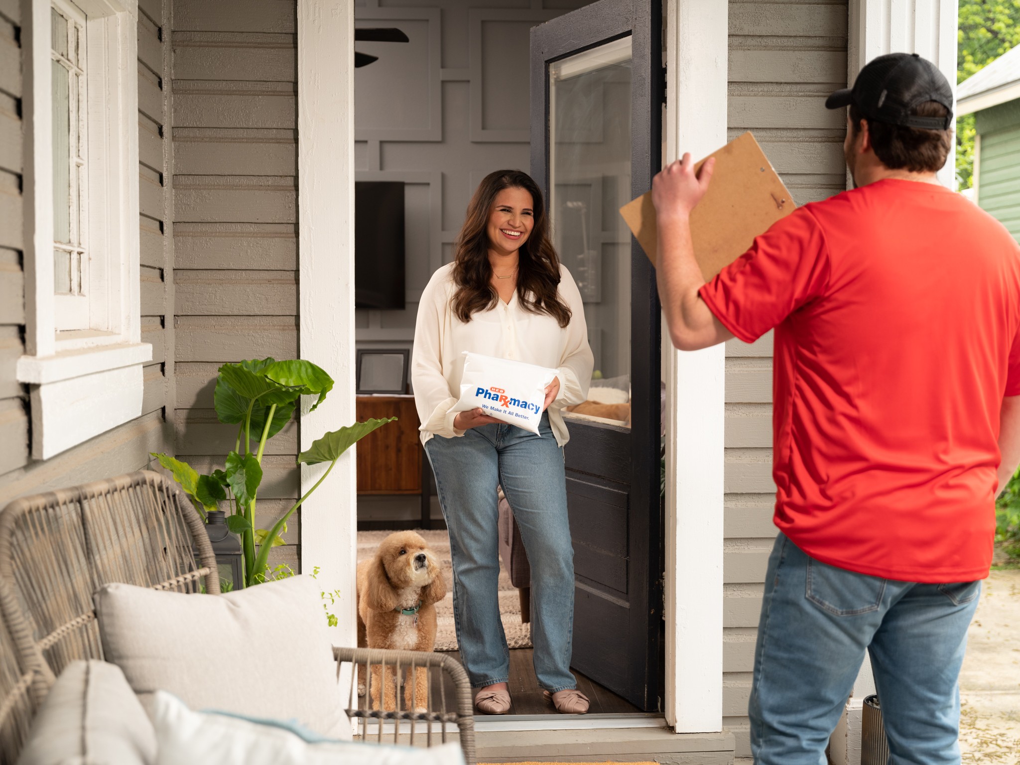
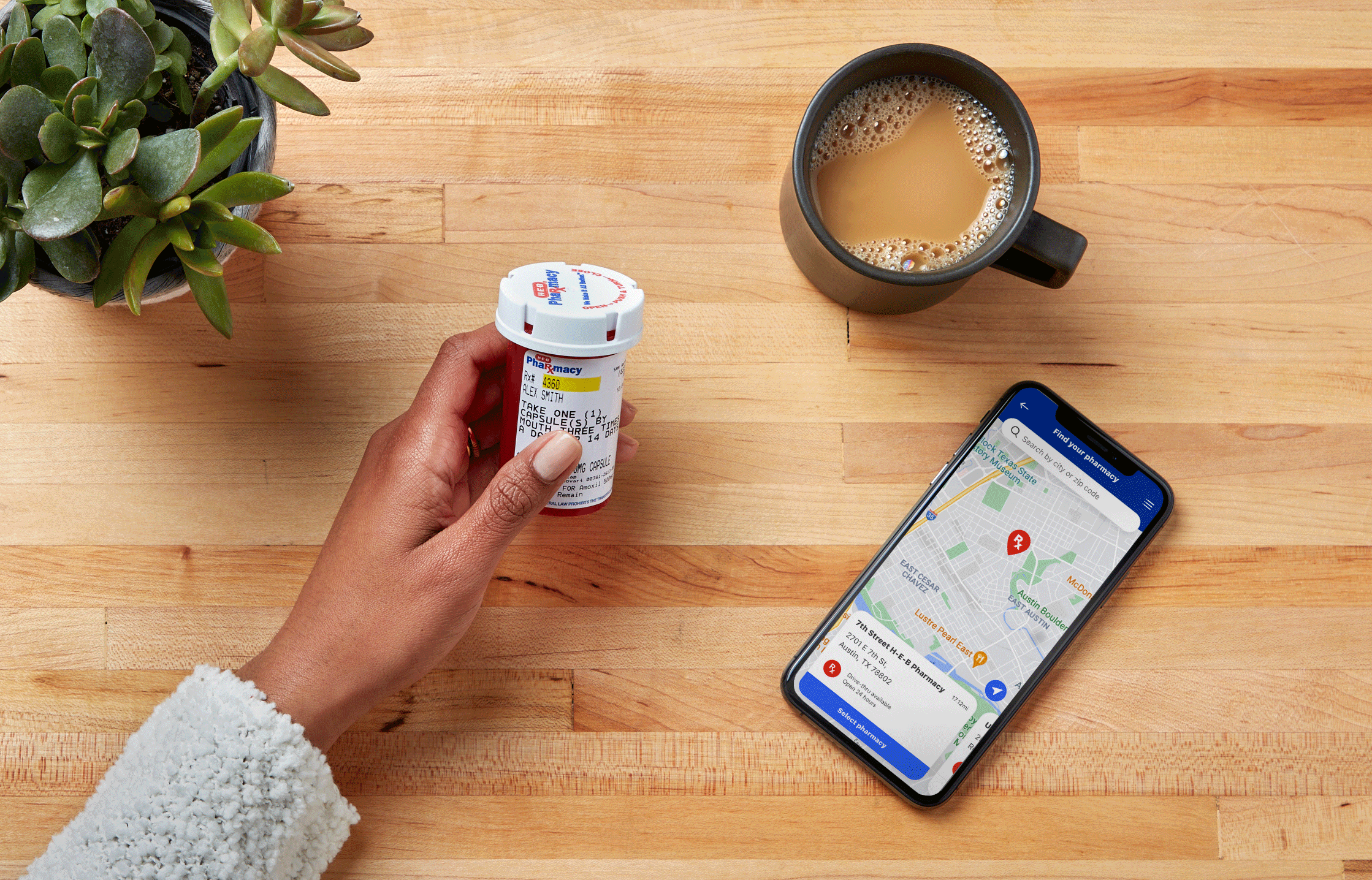
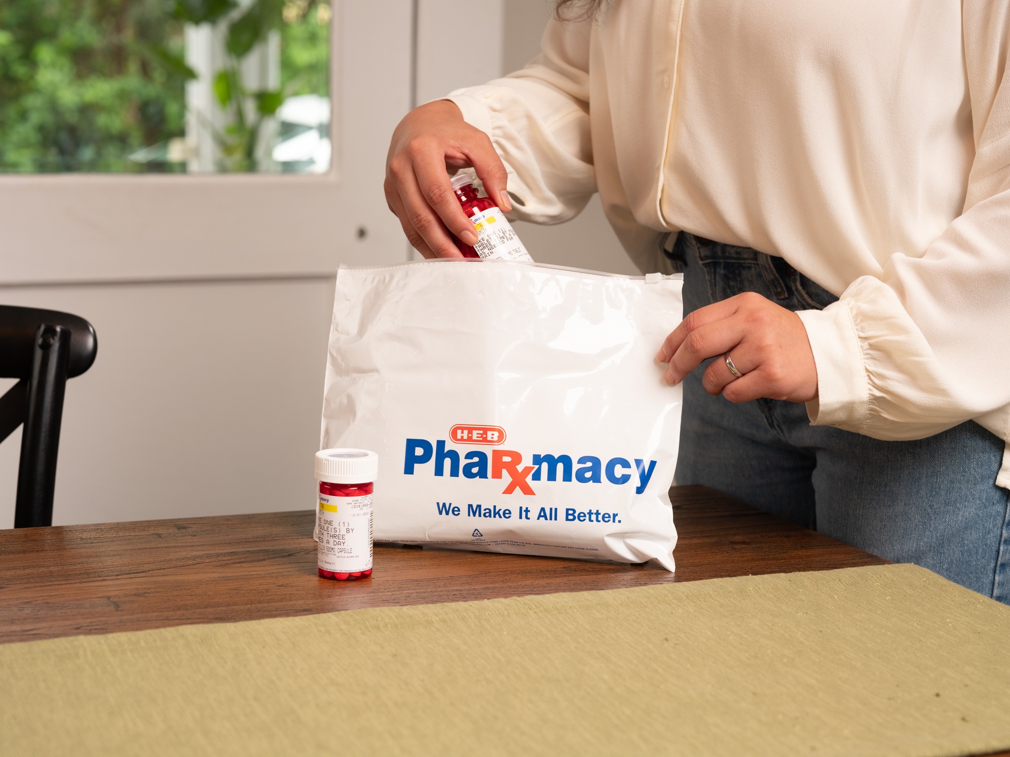
Photography is contextual, promotes our partners and stores, and sets expectations for customers.
Aspirational
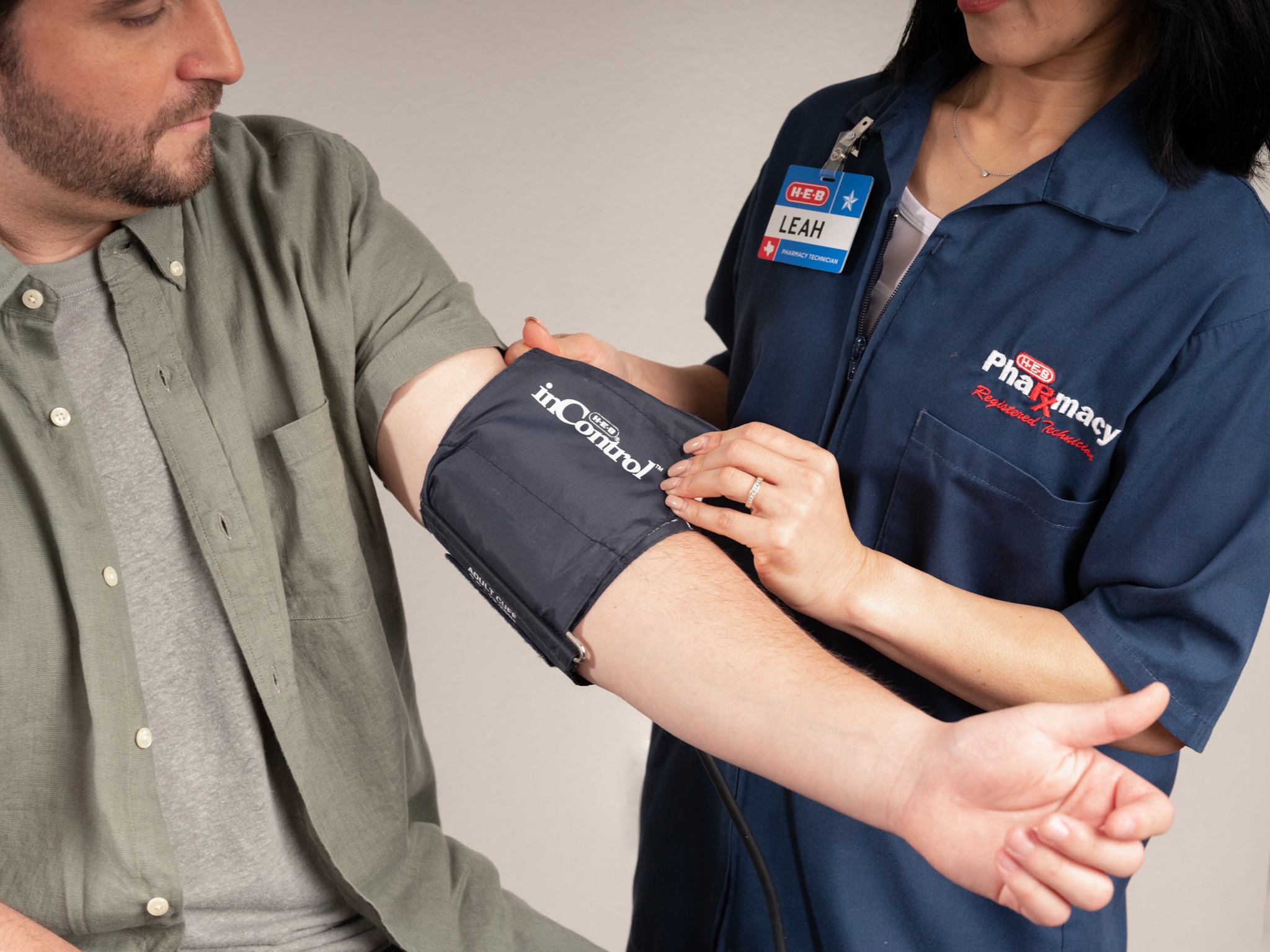
Wellness isn’t waiting in line at the pharmacy. We want to showcase lifestyle images of texans and their families.
Showcases a diverse range of texans.
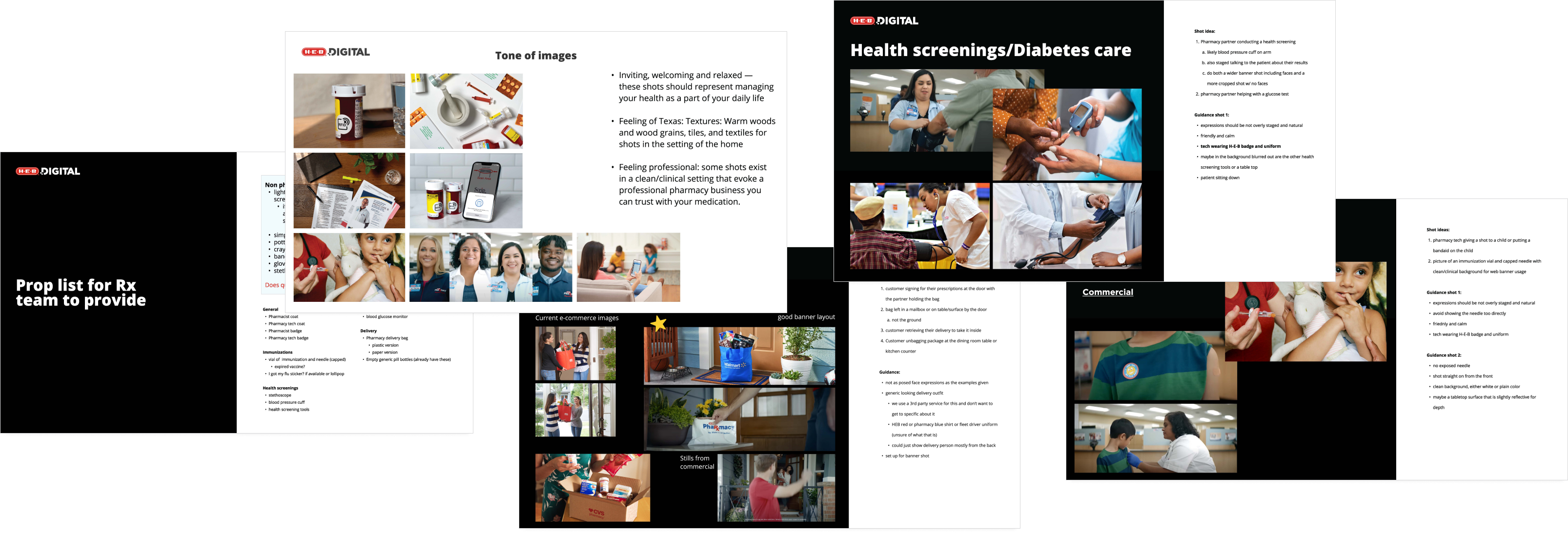
Pre-production and Art Direction
Defined shot list and artistic direction for photoshoots. Collaborated with an external studio and photographer for shots with models. Photographed product photography myself.

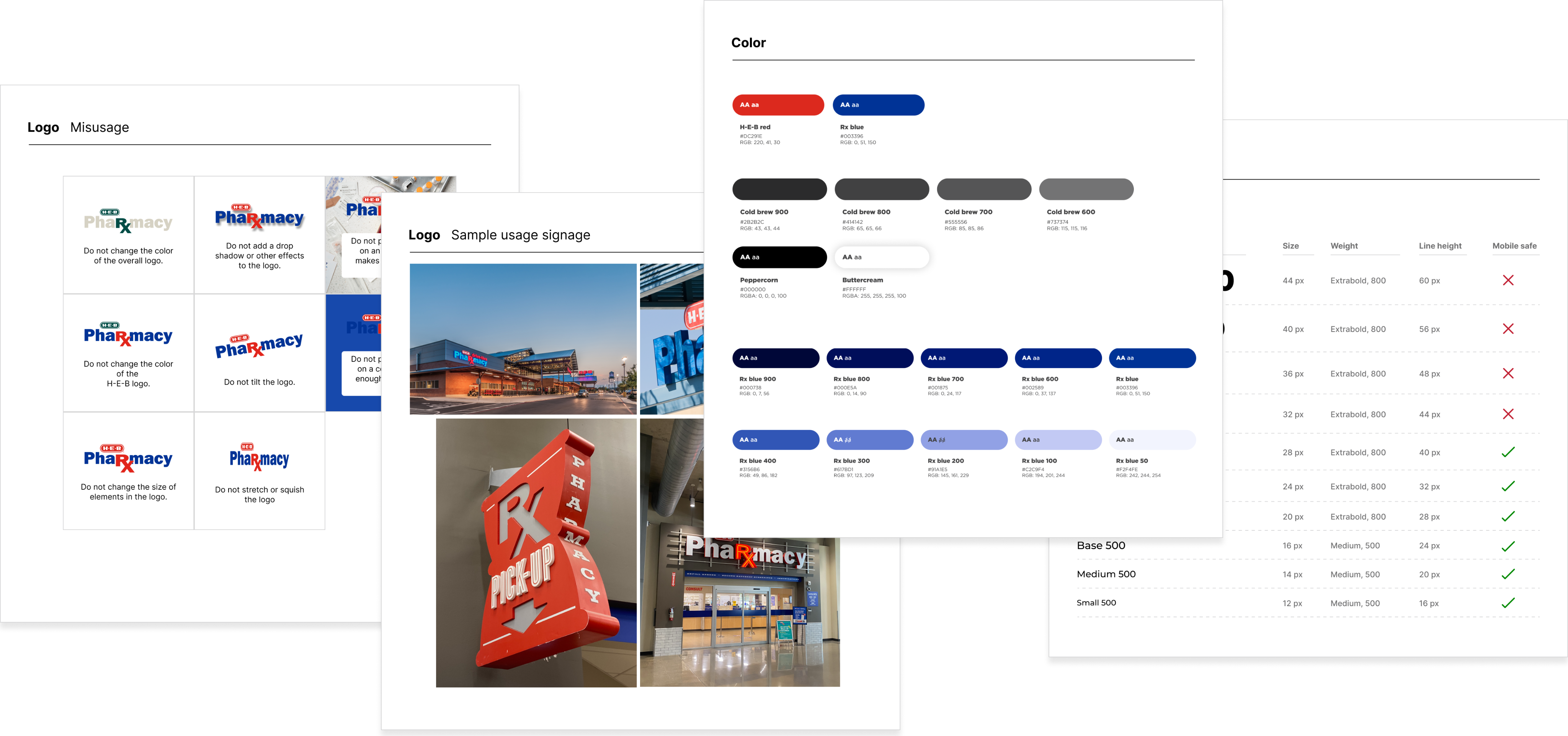
Basic Brand Guidelines
Before this project, there was a strong divide between in-store (print) marketing and digital marketing. I collaborated with our print marketing partner to develop guidelines that we use across both teams. We are now able to create cohesive seasonal campaigns.
Graphic Layouts
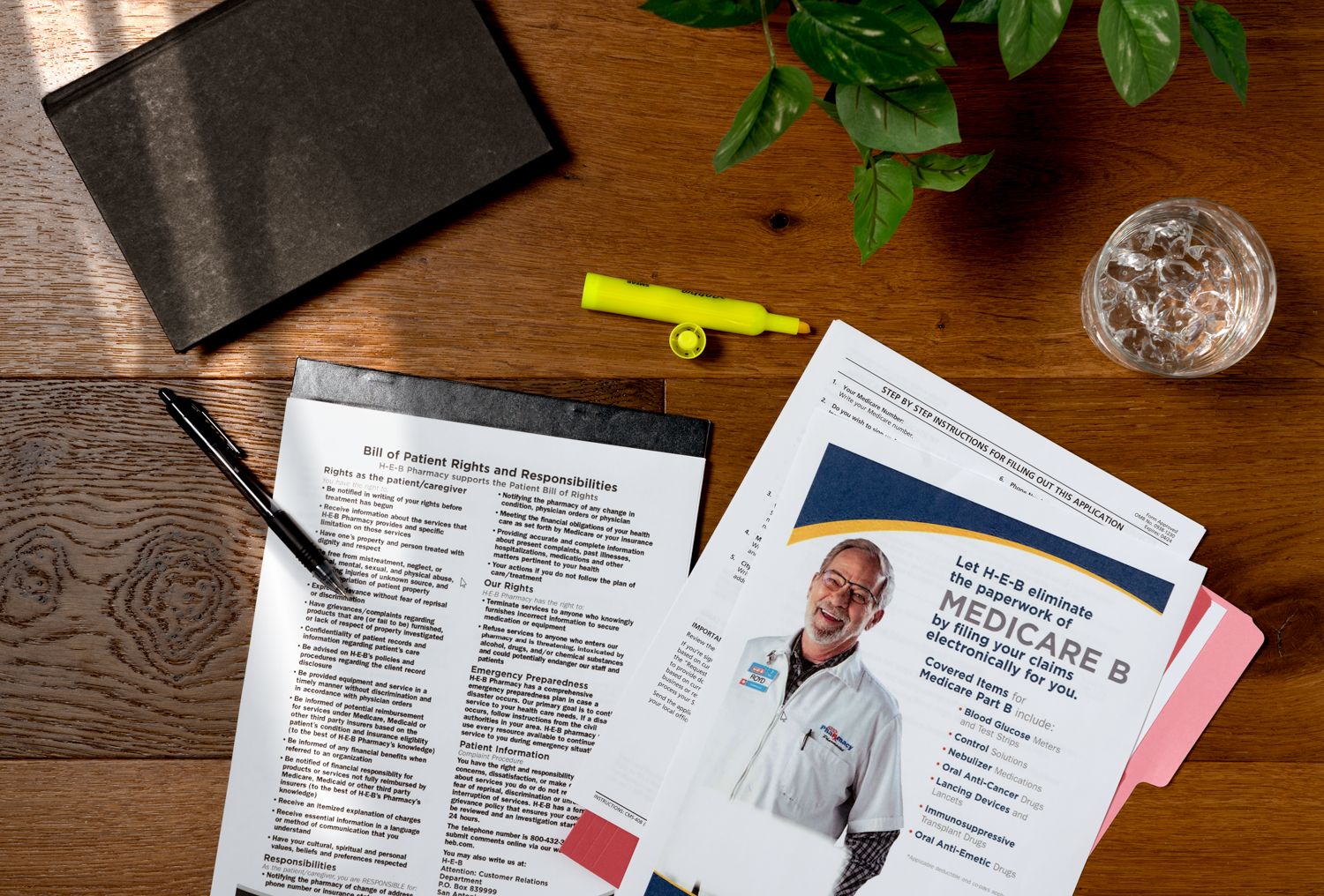
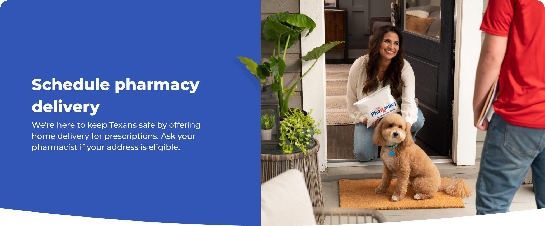
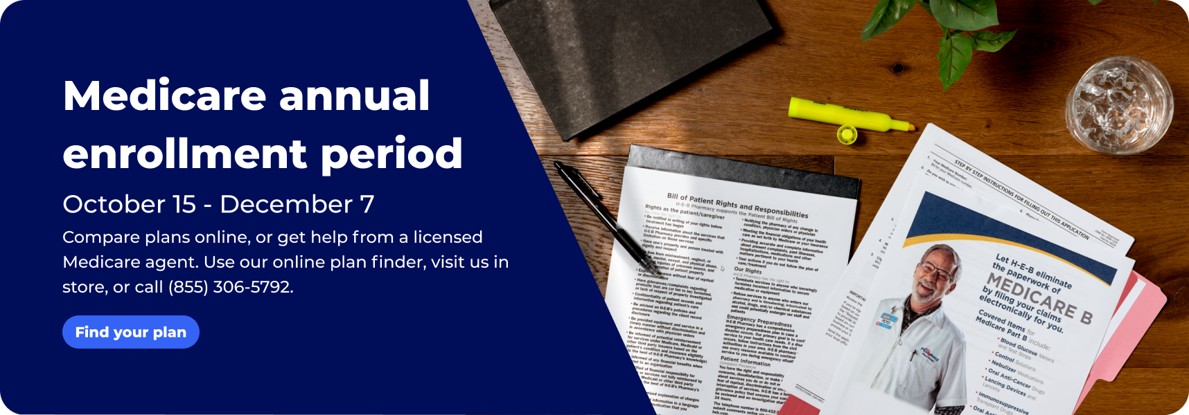
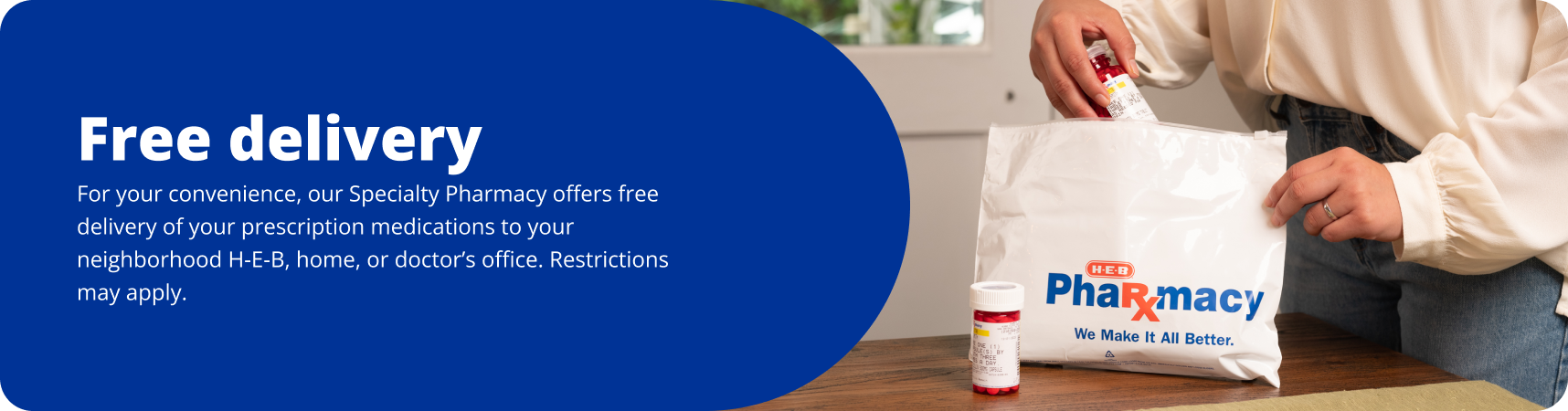
Photography used in the digital context. Graphic layouts are found in hero banners and seasonal, rotating banners.

Production ready
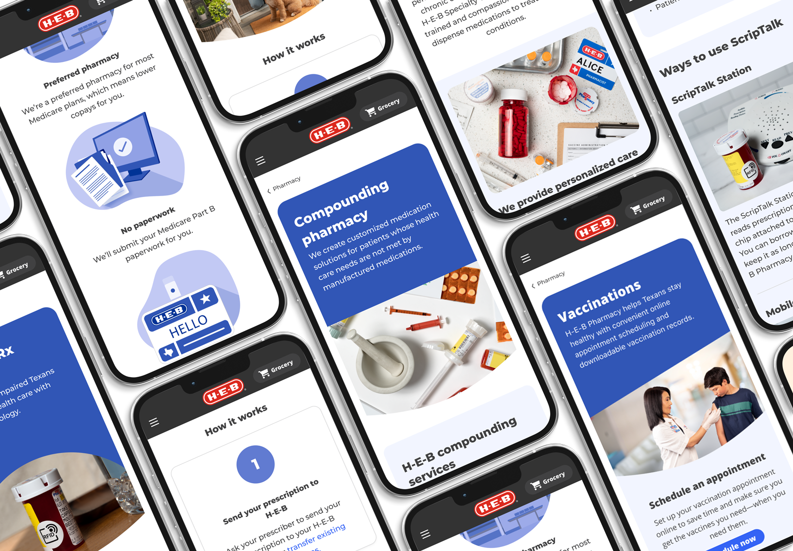
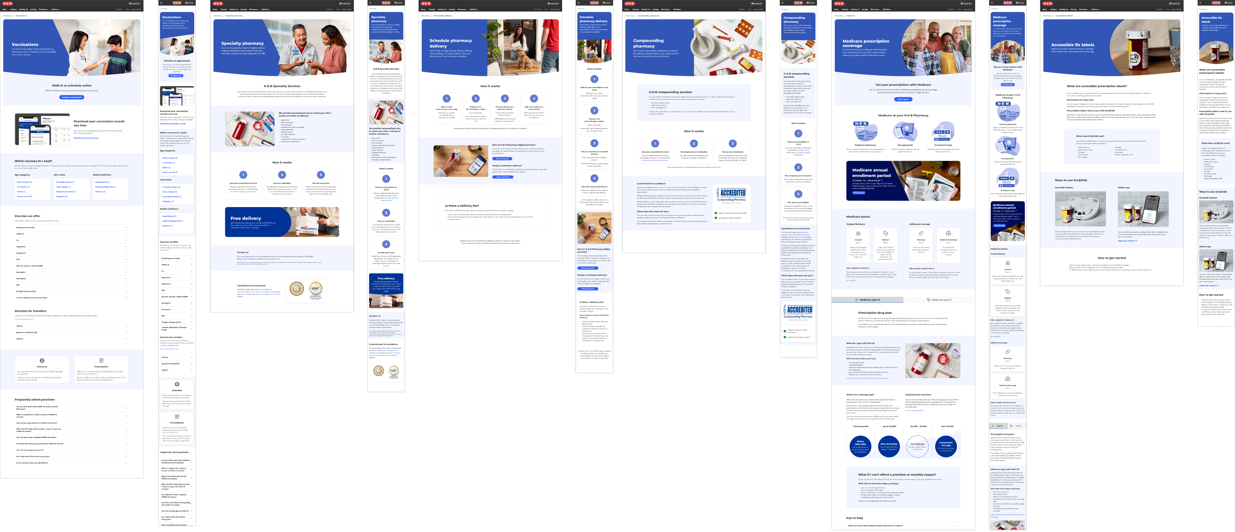
The work of creating each page and pushing it to production happened 1 by 1 for each service over the course of a year. Priority of builds were driven by business needs and how much content needed to be re-written.

Pharmacy home
heb.com/pharmacy

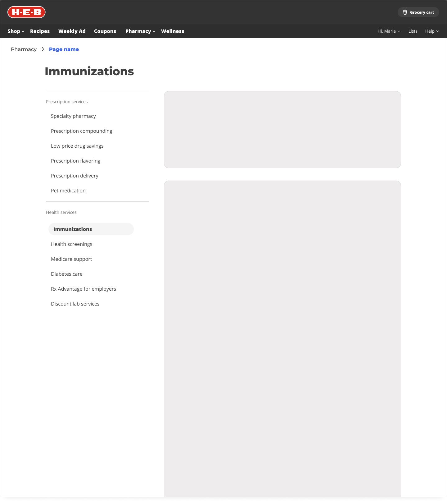
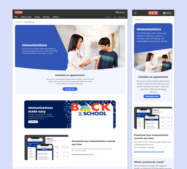
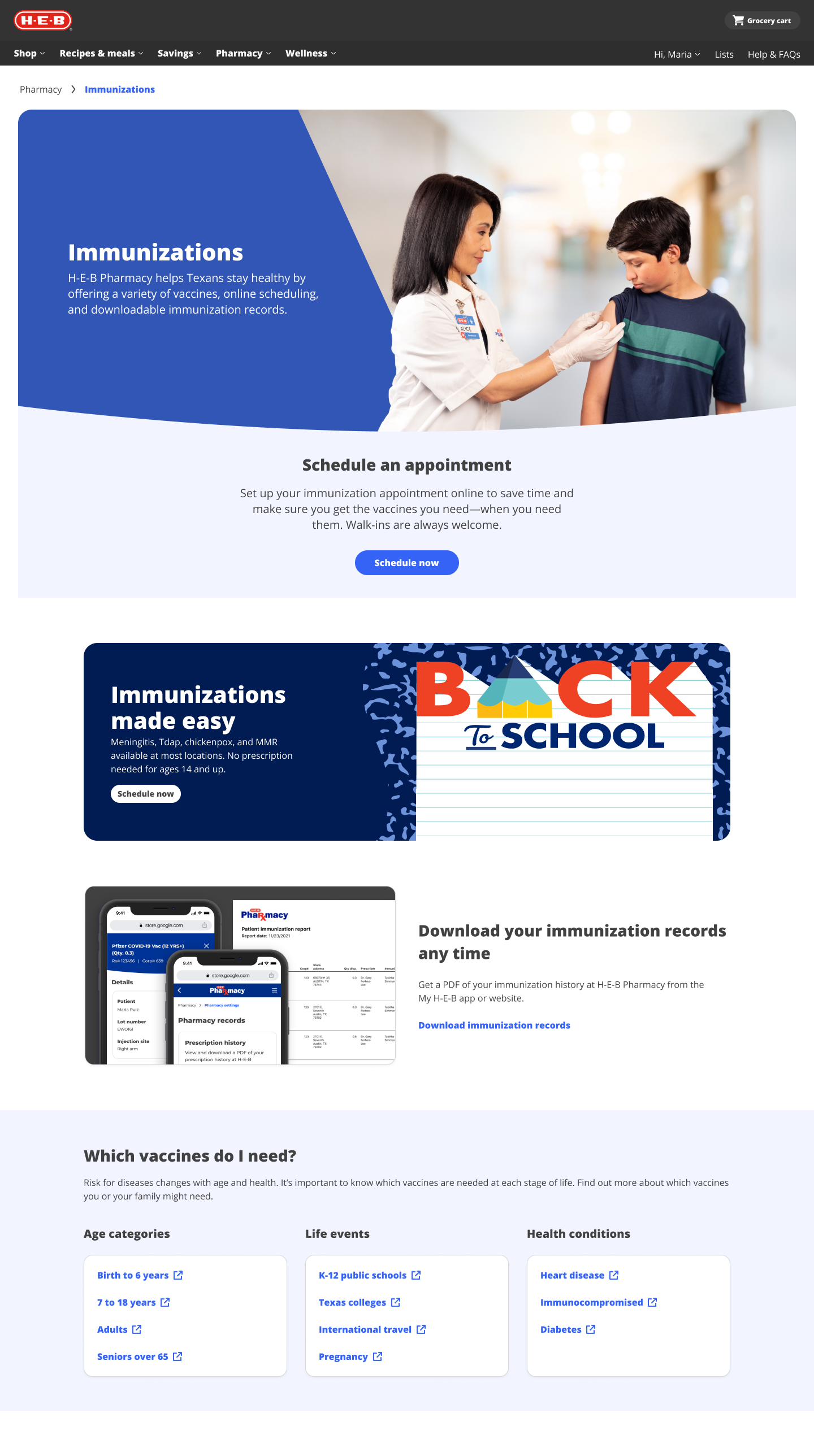
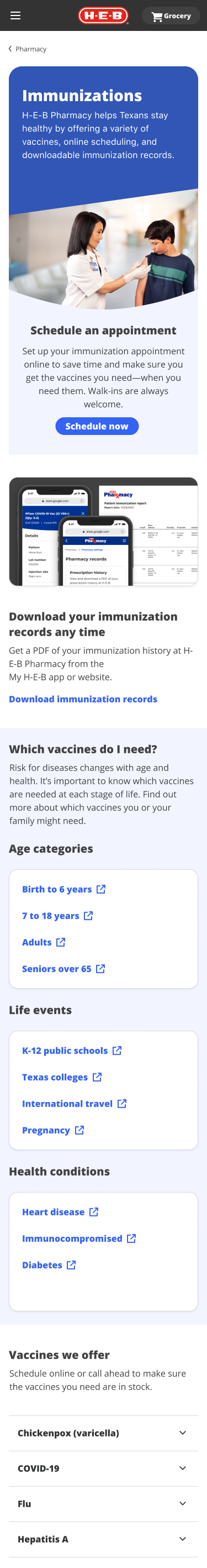
Immunizations page
Our highest-priority page based on findings from the decision matrix.

Drives new customers
Immunizations are a way to use H-E-B services without a prescription, so an immunization is often a customer's first experience with our services.

Used most often
5x higher click traffic than the next highest utilized marketing page. Also used by customers in store at their vaccine appointment.

Most Profitable
Immunizations are extremely profitable for pharmacies based on funding paid out by insurance companies and the government.

Contains seasonal promotions
Pharmacy marketing does multiple pushes through the year for vaccines such as back to school and sick season.
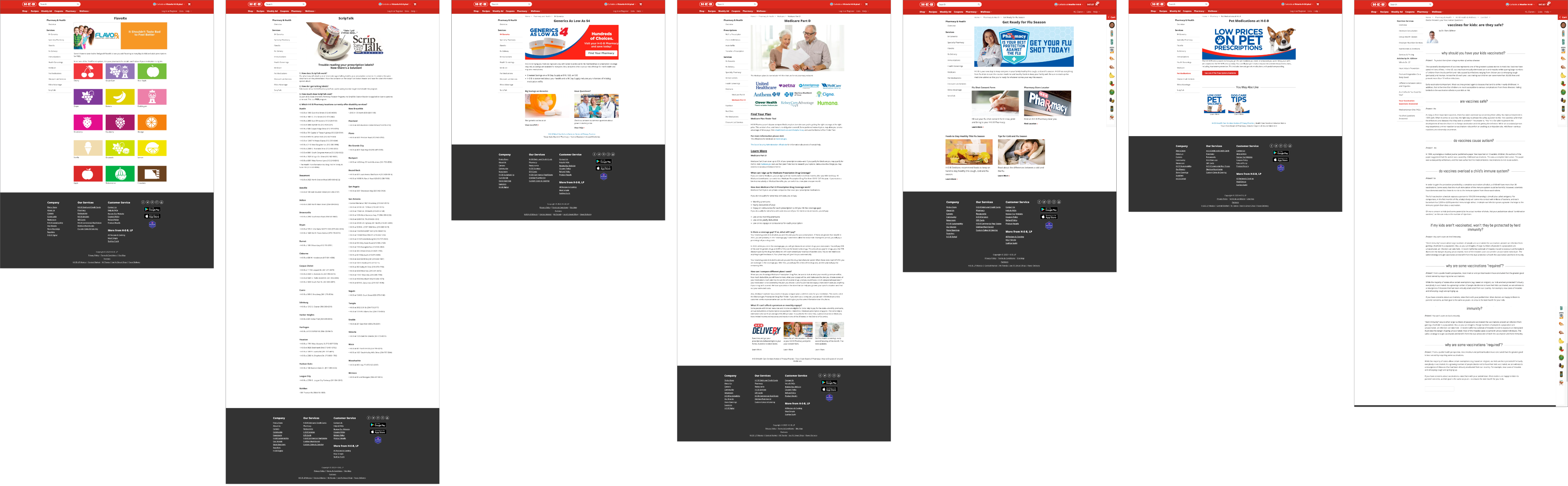
All Other Pages
Reflection
This project taught me the importance of pushing for good visual design, even when it takes time, labor resources, and budget. We learned how compelling our updates could be by using the first updated page (immunizations) to showcase the quality of work to business stakeholders who were otherwise difficult to wrangle. Overall, I improved my skills in cross-team collaboration, design advocacy, and extending brand guidelines to digital.
Pharmacy Digital Storefront
Feature: Marketing pages and brand assetsPlatforms: Web
Timeframe: 2022-24
Role: Primary product designer partnering with a content designer. For the photography, I served as art director and photo editor. For the brand assets, I was a collaborator along with our pharmacy marketing partner.

Accessible from the main navigation of heb.com, these pages introduce customers to H-E-B Pharmacy's full range of services.
Primary user
Prospective H-E-B customers
- Learn about H-E-B Pharmacy offerings
- Check if H-E-B has a certain offering
- Compare our service offerings to their current pharmacy provider
“Why should I switch to H-E-B?”
Secondary user
Current H-E-B Pharmacy Customers
- Get details about an offering they are aware of
- Learn about H-E-B Pharmacy offerings
- Learn about short-term (seasonal) offerings
“How do I get my flu shot this fall?”
Tertiary user
Employers
- Learn about the H‑E‑B RxTRA Advantage program
- Understand how to contact H-E-B or sign up for RxTRA Advantage
“What options do I have for my business?”
Original Live Pages
Not only unattractive, the pages were unmanaged and outdated when I joined the team. While all the marketing pages had severe heuristic issues, the immunizations page is a clear example of the worst themes in violations across the pages.
Original Site Map
The original site map highlights the inconsistencies across the pages. There were broken links, pages not discoverable from the global site navigation, pages only discoverable from google search, and redundant information repeated on multiple pages.
Decision Matrix
We decided on a new information architecture through card sorting exercises and meetings with business stakeholders. The decision matrix combines all the factors we considered.
New Site Map
The updated site map shows our new focus on making the service pages actionable. The old pages were ineffective at converting customers into action. In this new format, we provide links to next steps or further resources on the topic.
Base Template Work
Moving into working on the UI, the first step was to define a base template that all the pages could use.
Concept Options
Final Template
Pivot!
Throughout this process our design team was advocating for the need for new visual assets to make to overhaul worthwhile. What’s the point of restructuring some content if it’s still going to look unappealing?
The first step was to define our vision for what pharmacy and wellness at H-E-B should represent. Visuals follow the vision.
Empowering Texans with accessible food, care, and guidance that improves health outcomes and puts people over profits
Inclusive
Visual design should never come at the expense of accessibility.
A clean and simple UI is the top priority, and visual identity is the icing on the cake.
Related
The digital experience sets the stage for customer’s experiences with partners in stores, clinics, and telehealth calls.
Photography is contextual, promotes our partners and stores, and sets expectations for customers.
Aspirational
Wellness isn’t waiting in line at the pharmacy. We want to showcase lifestyle images of texans and their families.
Showcases a diverse range of texans.
Altruistic
Not driven by profits and selling products. We want to sell services and quality care.
Our use of more refined colors, contextual photography, and clean UI will differentiate us from the e-commerce experience.
Pre-production and Art Direction
Defined shot list and artistic direction for photoshoots. Collaborated with an external studio and photographer for shots with models. Photographed product photography myself.
Basic Brand Guidelines
Before this project, there was a strong divide between in-store (print) marketing and digital marketing. I collaborated with our print marketing partner to develop guidelines that we use across both teams. We are now able to create cohesive seasonal campaigns.
Graphic Layouts
Photography used in the digital context. Graphic layouts are found in hero banners and seasonal, rotating banners.
Production ready
The work of creating each page and pushing it to production happened 1 by 1 for each service over the course of a year. Priority of builds were driven by business needs and how much content needed to be re-written.
Pharmacy home
heb.com/pharmacy
Immunizations page
Our highest-priority page based on findings from the decision matrix.
Drives new customers
Immunizations are a way to use H-E-B services without a prescription, so an immunization is often a customer's first experience with our services.
Used most often
5x higher click traffic than the next highest utilized marketing page. Also used by customers in store at their vaccine appointment.
Most Profitable
Immunizations are extremely profitable for pharmacies based on funding paid out by insurance companies and the government.
Contains seasonal promotions
Pharmacy marketing does multiple pushes through the year for vaccines such as back to school and sick season.

Macbook Pro


All Other Pages
Reflection
This project taught me the importance of pushing for good visual design, even when it takes time, labor resources, and budget. We learned how compelling our updates could be by using the first updated page (immunizations) to showcase the quality of work to business stakeholders who were otherwise difficult to wrangle. Overall, I improved my skills in cross-team collaboration, design advocacy, and extending brand guidelines to digital.
Pharmacy Digital Storefront
Feature: Marketing pages and brand assetsPlatforms: Web
Timeframe: 2022-24
Role: Primary product designer partnering with a content designer. For the photography, I served as art director and photo editor. For the brand assets, I was a collaborator along with our pharmacy marketing partner.
Manage Pharmacy profiles
Feature: Profile management
Platforms: native and web
Timeframe: 2023
Role: I served as the primary designer leading the project. I worked with our product owner and product manager to define technical requirements and worked through to QA with engineers.
Accessible from the main navigation of heb.com, these pages introduce customers to H-E-B Pharmacy's full range of services.
Users
Primary user
Prospective H-E-B customers
- Learn about H-E-B Pharmacy offerings
- Check if H-E-B has a certain offering
- Compare our service offerings to their current pharmacy provider
“Why should I switch to H-E-B?”
Secondary user
Current H-E-B Pharmacy Customers
- Get details about an offering they are aware of
- Learn about H-E-B Pharmacy offerings
- Learn about short-term (seasonal) offerings
“How do I get my flu shot this fall?”
Tertiary user
Employers
- Learn about the H‑E‑B RxTRA Advantage program
- Understand how to contact H-E-B or sign up for RxTRA Advantage
“What options do I have for my business?”
Original Live Pages
Not only unattractive, the pages were unmanaged and outdated when I joined the team. While all the marketing pages had severe heuristic issues, the immunizations page is a clear example of the worst themes in violations across the pages.
Original Site Map
The original site map highlights the inconsistencies across the pages. There were broken links, pages not discoverable from the global site navigation, pages only discoverable from google search, and redundant information repeated on multiple pages.
Decision Matrix
We decided on a new information architecture through card sorting exercises and meetings with business stakeholders. The decision matrix combines all the factors we considered.
New Site Map
The updated site map shows our new focus on making the service pages actionable. The old pages were ineffective at converting customers into action. In this new format, we provide links to next steps or further resources on the topic.
Base Template Work
The first step of working on the user interface was to define a base template that all the pages could use.
Concept Options
Final Template
Pivot!
Throughout this process our design team was advocating for the need for new visual assets to make to overhaul worthwhile. What’s the point of restructuring some content if it’s still going to look unappealing?
The first step was to define our vision for what pharmacy and wellness at H-E-B should represent. Visuals follow the vision.
Empowering Texans with accessible food, care, and guidance that improves health outcomes and puts people over profits
Inclusive
Visual design should never come at the expense of accessibility.
A clean and simple UI is the top priority, and visual identity is the icing on the cake.
Related
The digital experience sets the stage for customer’s experiences with partners in stores, clinics, and telehealth calls.
Photography is contextual, promotes our partners and stores, and sets expectations for customers.
Aspirational
Wellness isn’t waiting in line at the pharmacy. We want to showcase lifestyle images of texans and their families.
Showcases a diverse range of texans.
Altruistic
Not driven by profits and selling products. We want to sell services and quality care.
Our use of more refined colors, contextual photography, and clean UI will differentiate us from the e-commerce experience.
Pre-production and Art Direction
Defined shot list and artistic direction for photoshoots. Collaborated with an external studio and photographer for shots with models. Photographed product photography myself.
Basic Brand Guidelines
Before this project, there was a strong divide between in-store (print) marketing and digital marketing. I collaborated with our print marketing partner to develop guidelines that we use across both teams. We are now able to create cohesive seasonal campaigns.
Graphic Layouts
Photography used in the digital context. Graphic layouts are found in hero banners and seasonal, rotating banners.
Production ready
The work of creating each page and pushing it to production happened 1 by 1 for each service over the course of a year. Priority of builds were driven by business needs and how much content needed to be re-written.

Pharmacy home
heb.com/pharmacy
Immunizations page
Our highest-priority page based on findings from the decision matrix.

Macbook Pro


Drives new customers
Immunizations are a way to use H-E-B services without a prescription, so an immunization is often a customer's first experience with our services.

Used most often
5x higher click traffic than the next highest utilized marketing page. Also used by customers in store at their vaccine appointment.

Most Profitable
Immunizations are extremely profitable for pharmacies based on funding paid out by insurance companies and the government.

Contains seasonal promotions
Pharmacy marketing does multiple pushes through the year for vaccines such as back to school and sick season.
All Other Pages
Reflection
This project taught me the importance of pushing for good visual design, even when it takes time, labor resources, and budget. We learned how compelling our updates could be by using the first updated page (immunizations) to showcase the quality of work to business stakeholders who were otherwise difficult to wrangle. Overall, I improved my skills in cross-team collaboration, design advocacy, and extending brand guidelines to digital.